


A website is the hub of a business’s online marketing efforts. This site is often where potential customers go to learn more about what a company does — meaning it is one of the biggest opportunities that a business will get to sell visitors on their brand.
Eye-catching and functional design is crucial for businesses wanting to take full advantage of this opportunity. In a second, you can give visitors a real idea of what your company is all about while encouraging them to learn more with stunning visuals and strong design.
These seven killer websites show how creativity and good design can elevate a site above the competition:
1. Powerhouse Company
Motion and interactivity are big trends in web design this year.
Powerhouse Company’s homepage shows off why so many businesses are following the trend — and architectural firms are no exception.
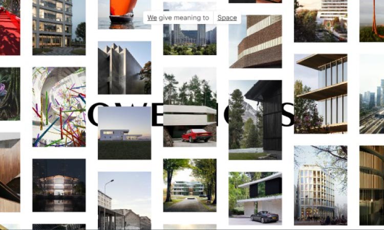
The homepage consists of an array of thumbnails from the firm’s previous projects. Dragging the mouse allows you to move the array around. There’s also a set of buttons at the top that enable you to filter the projects by type — graying out anything that’s not related to offices, furniture, interior design or any other category you search.
If you’re interested in building a page where interactivity and motion are key elements, Powerhouse’s site provides a solid model to keep in mind.
2. Koox
Most companies, when deciding on visuals that represent their brand, reach for photos or clean graphic designs with vector illustrations. Both of these approaches can be very effective and certainly have their place in successful websites of all sorts. However, they’re not the only options. You can also use illustrations that emulate traditional work. The textures and noise in this kind of art can give your site’s visuals a looser and more energetic feel.
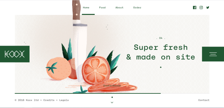
Koox, a London-based food delivery service that works with top restaurants in the city, shows how hand-drawn designs can add real character to a website. The site prominently features a handful of food drawings, created by animator and illustrator Tristan Gion. While images or clean-looking vector graphics could have added a more sleek atmosphere, the drawings make the company’s brand and personality more relatable.
If you want to emphasize an energetic, hand-crafted feel in your work, following Koox’s example and considering other illustration styles could provide some exciting and on-brand results.
3. Equitone
If your business produces physical items, you can put the look and visual feel of these products on display with the right design choices.
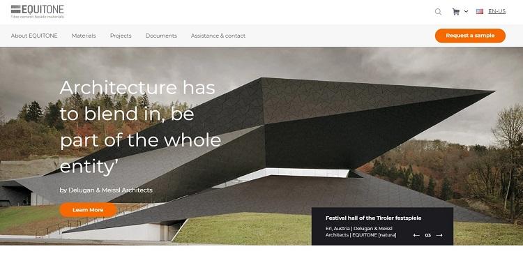
Equitone, which manufactures fibre cement for building facades, takes advantage of a central image that shows off material texture and pattern to create a website that catches the eye.
The rest of the site plays along with this design element. The color scheme is simple, consisting of neutrals and an orange accent. There are also some essential site features — including a navigation header with links to important info, a search field and the option to change site language.
4. Deep Sleep Studio
For many websites, much of the design focus is placed on the content above the fold. However, this isn’t the only way of doing things.
Deep Sleep Studio, a design agency that provides visual direction and video for clients, shows how you can take advantage of vertical space. As you scroll down the page, snippets of work from various agency projects appear — sometimes as a full-screen video, other times as images that sum up a project.
For brands with a lot of work and visuals they want to showcase, this kind of interactive design that takes advantage of the space below the fold can be extremely effective.
5. American Astronomical Society
Motion and interactivity are big trends in web design this year. Powerhouse’s site shows how interactivity can be used as a central design element, and it proves that it’s possible to build a homepage entirely around motion and interactive components.
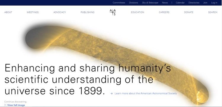
The American Astronomical Society (AAS) shows how a subtler, more playful interactivity also works. When the cursor is dragged over the white space in the center of the page, it temporarily reveals a portion of a vibrant, astronomical image — in the same way that astronomers scan sections of the sky to observe celestial bodies.
The rest of the site is more conventional in design but backs up this more playful and innovative element while keeping the site functional for professionals and society members. The header is designed with everything necessary to keep it both visually appealing and practical, and all the important webpages are easy to access.
If you’re interested in experimenting with interactive elements but are worried they might dominate your site’s design, the AAS provides a useful counterexample. Subtle interactivity is possible and can still add a lot to a page.
6. Worth & Worth
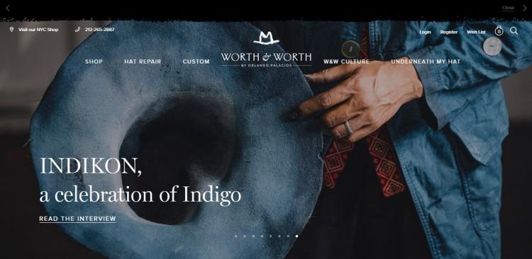
Worth & Worth, as with Equitone, makes the company’s products a primary design element. This homepage features a large, central slideshow of several images that display high-res photos of the company’s products, often with a focus on the materials and craftsmanship.
At a glance, the rest of the homepage looks fairly standard — with a header providing quick access to important pages and the brand logo front and center. Hovering over header items reveals further information, as well as a few more high-quality photos of the company’s products.
If you have access to comparable photos of your company’s goods, this website is one worth emulating. The homepage shows how you can integrate strong images into a more standard design.
7. Rekki
If you’re ambitious, it’s possible to do away with literal visuals almost entirely.
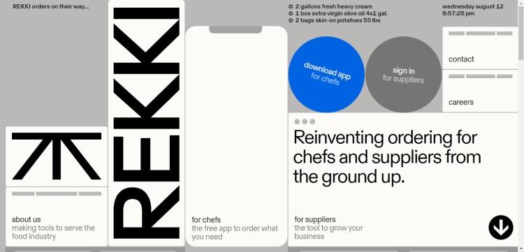
Rekki, an ordering app that connects chefs to suppliers, is a great example of this. The page manages to tell the brand’s entire story with nothing but simple colors, text and shapes. As with the other sites on this list, it also puts essential information front and center — both the app download link for chefs and the supplier sign-in are readily visible on a cursory scan of the page.
If you want to take a risk on a more innovative and abstract design, Rekki’s example is a good one to follow.
These Sites Show the Power of Web Design
If you need some inspiration for your company’s website, these seven sites show how various design approaches can work. No matter what values you want to emphasize, you can use solid web design to communicate what your business stands for and encourage visitors to investigate your work further.
Author:
Lexie is an IoT enthusiast, an aspiring Olympic curler and a web designer. She enjoys hiking with her goldendoodle and checking out local flea markets. Visit her design blog, Design Roast, and connect with her on Twitter @lexieludesigner.
